

Key takeaways
- I rebuilt mommyrefuel.com from zero on September 4: a real multi-page site instead of a single scrolling landing page.
- The hero and product pages now show 27 real iPhone screen captures from the actual app, not illustrations or mockups.
- The whole site ships in English and Ukrainian, page for page, with the same design tokens the iOS app uses (Manrope only, no italics, no invented icons).
- I also laid the first infrastructure for moving hosting off the old host and onto AWS (Amplify build config, a Route 53 hosted zone) — the actual DNS cutover came a day later.
- Nothing about the app itself changed today. This was entirely the website you're reading right now.
Why the old site had to go
Mommy Refuel started, like most things, with a single scrolling landing page: a hero, a pitch, a waitlist form. That was fine for getting the idea in front of people early. It stopped being fine once there was an actual product behind it — a real Refuel Score, a real Check-In, a real Care Circle — and the site still looked like a promise instead of a thing you could see.
I'd already spent part of the summer adding motion and polish on top of that old structure: a custom cursor, magnetic buttons, a cinematic curtain that opens on load. Some of that shipped this same morning (PR #11, PR #12). It looked nicer. It was still the wrong shape. A single page can't hold a product with this many honest, separate parts — privacy, safety, the AI, the family features — without turning into one very long scroll nobody finishes.
What happened, in order
The morning was spent tightening the old design: a dark, warm editorial palette replaced the previous light theme (commit d633692), with contrast checked against real numbers — body text around 14:1, secondary text around 7:1 — not just "looks fine to me." A cinematic overture curtain and a slow-drifting background mood shipped alongside it (commit d6c3f80), fully gated behind prefers-reduced-motion so it never traps or distracts anyone who has motion sensitivity turned on.
By early evening it was clear that polishing the old page further wasn't the real fix. So I rebuilt it from zero: a new homepage narrative that actually walks through the product (opening → daily check-in → Refuel Score → one small thing you can do today → how it looks over months → your whole life in one place → Refuel AI → Care Circle → private by design → the wider ecosystem → close), 20 real routes instead of one, and full English/Ukrainian twins for every one of them — 48 pages in total (commit 3d49723).
Real screens, not mockups
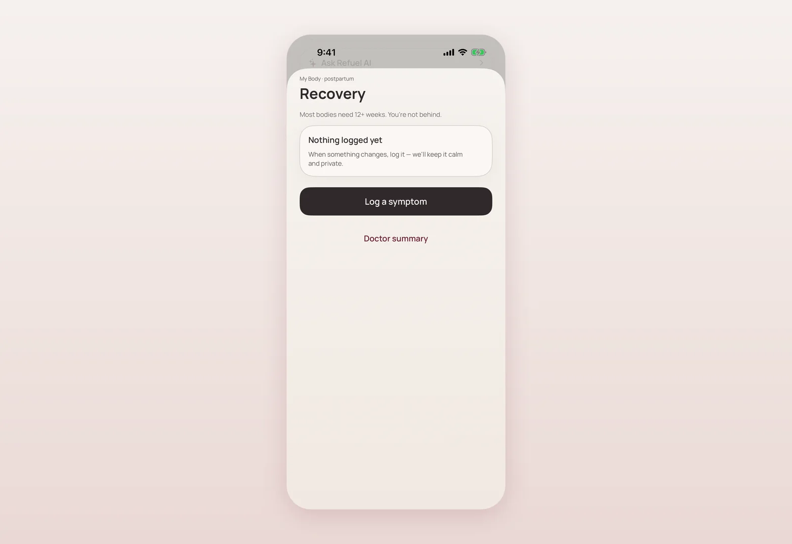
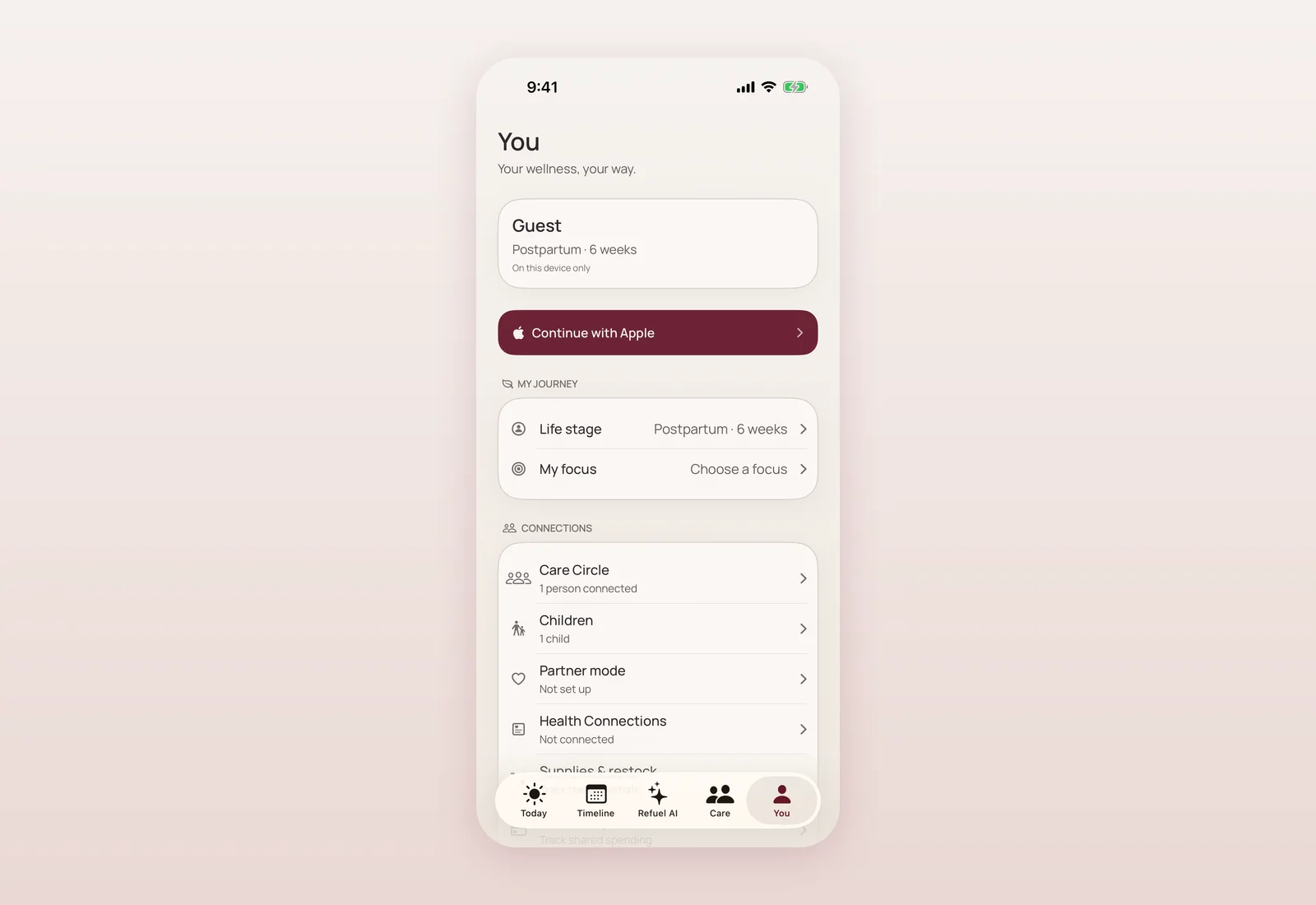
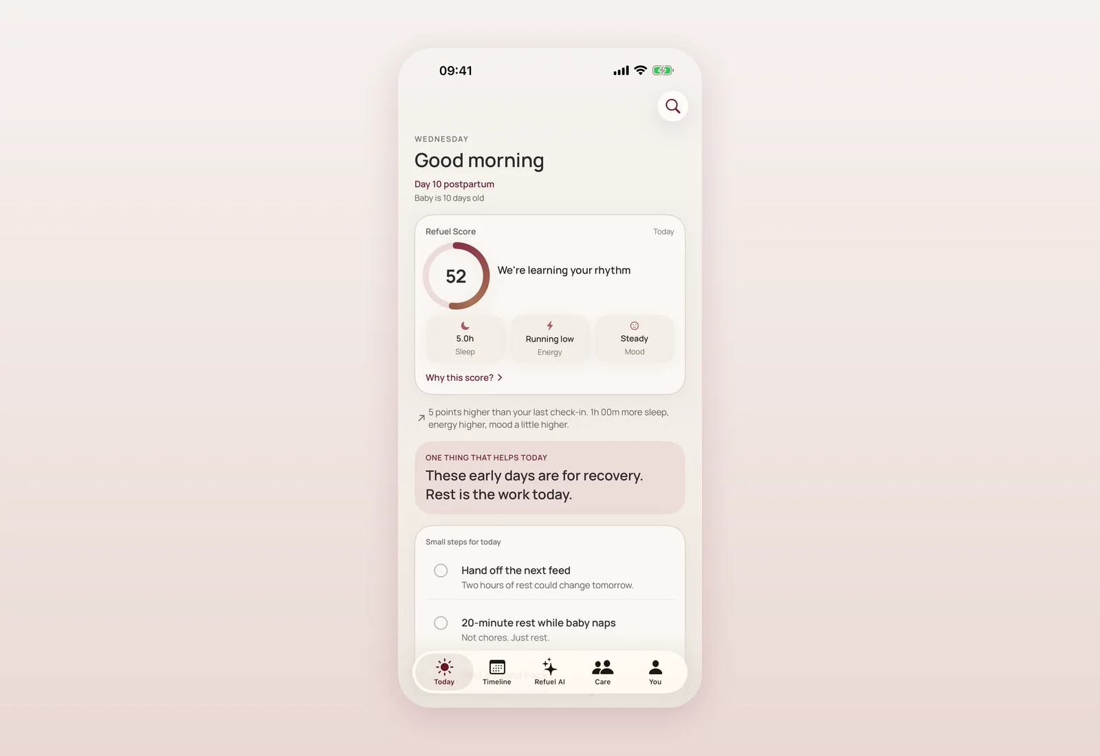
The thing I'm most stubborn about: every device you see on the site is a real capture from the real iOS app, not an illustration someone drew to look like an app. I added a debug-only launch hook to the app (compiled out of every real build, so it never ships to anyone) that seeds the demo state and jumps straight to a given screen, then ran 27 captures through the iOS Simulator and an AVIF/WebP pipeline for the site. They're presented three ways depending on context — full device frame, a tight crop, or a macro close-up on one detail — so the same screenshot can carry a hero moment or a small supporting point without looking repeated.
It matters to me that a mother scrolling the site before downloading the app sees the actual Refuel Score ring, the actual Check-In screen — not a stock-photo interpretation of what a wellbeing app might look like.
One design language, not two
The site now pulls from the exact same tokens as the iOS app: Manrope as the only typeface, the same color and radius values (MRColor and MRRadius, mirrored into the site's CSS), no animation libraries, and everything reduced-motion safe. That sounds like a small detail, but it means the app and the website will never quietly drift apart into two different brands the way a lot of app sites do. If the app's palette changes, the site's does too, on purpose, in one place.
Quietly moving the ground underneath
In parallel with the visual rebuild, I started the infrastructure work to move the site's hosting onto AWS. Through the morning I fixed the Amplify build pipeline for a monorepo layout — per-app dependency installs, correct build paths, and loading the right SSR runtime variables (commits 2d962c2, b5244c5, af088dc, 28cf948) — so the site, the internal Control Center dashboard, and the survey tool can all build and deploy from the same repository without stepping on each other. Later in the day I added a Route 53 hosted zone in Terraform (commit 2cc2c18) and fixed Apple sign-in for the internal staff dashboard (commit 847444f). None of this is visible to a visitor; it's the plumbing that made the actual domain cutover possible the next day.
Where and when
- Sept 4, ~10:11–10:25 — Amplify monorepo build pipeline fixed for multi-app deploys (2d962c2, b5244c5, af088dc, 28cf948).
- Sept 4, ~10:36 — Desktop pointer layer (custom cursor, magnetic CTAs) merged to mommyrefuel.com (PR #11).
- Sept 4, ~13:24 — Cinematic curtain and scroll-driven background mood merged (PR #12, commit d6c3f80).
- Sept 4, ~17:03 — Dark editorial palette merged (PR #13, commit d633692).
- Sept 4, ~17:12 — Route 53 hosted zone added in Terraform, ahead of the DNS move (2cc2c18).
- Sept 4, ~17:31 — Apple sign-in fixed for the internal staff/Control Center tool (847444f).
- Sept 4, ~19:55 — Full site rebuilt from zero: 20 routes × EN/UK, 27 real app captures, new homepage narrative (commit 3d49723).
- Sept 4, ~19:58 — Laptop-viewport and contrast fixes on top of the rebuild (0346224). Website only — no app, backend or App Store changes today.
What this actually means if you're reading this on mommyrefuel.com
If you visited the site before today, you were looking at a pitch. From today, you're looking at pages that mirror what the app actually does, in your language, with real screens. You can read about the Refuel Score without downloading anything first, see how Care Circle works, or read the Ukrainian version of every single page — it isn't a translated afterthought, it's built page for page from the start.
What's next
The site rebuild set the stage for two things that landed within the following days: a deeper multi-page expansion with honest status pages for what's live versus planned, and the actual DNS cutover to the new hosting. Those are their own posts.
Questions mothers ask
Did the app change on September 4?
No. This was entirely the website (mommyrefuel.com) — a full rebuild of the marketing and informational site. The iOS app itself was untouched that day.
Are the phone screens on the site real or mockups?
They're real captures from the actual iOS app, taken through a debug-only launch hook that never ships in real builds, then processed through an image pipeline for the web. Nothing is illustrated or simulated.
Is the Ukrainian version of the site a translation of the English one?
It's built as a full twin of every page rather than an afterthought, but the aim is the same honest content in both languages, page for page.
Why move hosting to AWS?
The old host wasn't built for a monorepo with several apps (site, Control Center staff dashboard, survey tool) deploying together. AWS Amplify handles that better. The groundwork went in this day; the actual domain cutover happened the next day, September 5.

Product designer and engineer from Kyiv who designed and built Mommy Refuel end to end. CTO at Kyiv Academy of Media Arts, founder of seven a.m. He writes every product update here: what shipped, where and when.
About SerhiiAvailability can vary with the installed app version. Statuses are founder-confirmed at the time of writing.