
Key takeaways
- Replaced the single-page coming-soon site with a real, 20-route, bilingual (EN/UK) product website with full content for every section — 40 pages in total.
- Fixed a live bug where the site's logo was loading a 242 KB embedded image on every page, slowing it down and making it look broken; replaced with a 3 KB vector mark.
- Redesigned the site twice more the same day: a v2 editorial pass with a fixed header and motion system, then a v3 Next.js rebuild with a custom cursor and magnetic buttons.
- Unified the site's design system with the app itself — one font (Manrope), one set of colour and radius tokens — so the site and the app finally look like the same product.
- Built and hardened the Control Center, our first internal dashboard, and moved hosting off a third-party host onto AWS while keeping Supabase as the backend.
First, a live bug: a 242 KB logo
Before any redesign, I found and fixed something embarrassing: the site's masthead logo file had a 242 kilobyte image baked directly into it, loaded eagerly on every single page. That is a lot of weight for a mark that should be a few kilobytes, and it was making the site slow to render — on a slower connection, it could genuinely look broken while the logo loaded in. I replaced it with a clean, scalable vector mark styled after the actual iOS app icon, in light and dark variants, at roughly 3 KB each. A small fix, but the kind that matters more than most feature work, because it affects literally every visitor on every page.
From one page to a real website
The site had been a single coming-soon landing page since the very start. I rebuilt it from scratch as a real multi-page product, brand, trust and investor site — twenty distinct routes, each in English and Ukrainian, forty pages total, generated from a shared design system and page templates rather than hand-duplicated HTML. Every section of the app got its own real page: the mother's experience, planning, pregnancy, baby, memories, care circle, health, the AI assistant, the marketplace, how it works, privacy and safety, resources, about, investors, support, early access, download.
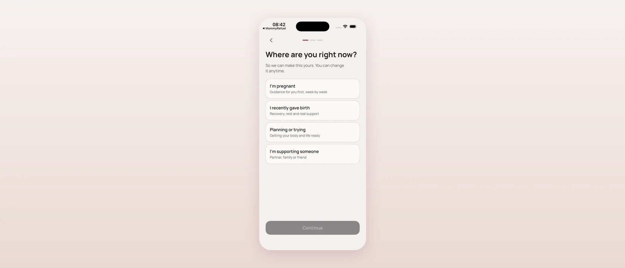
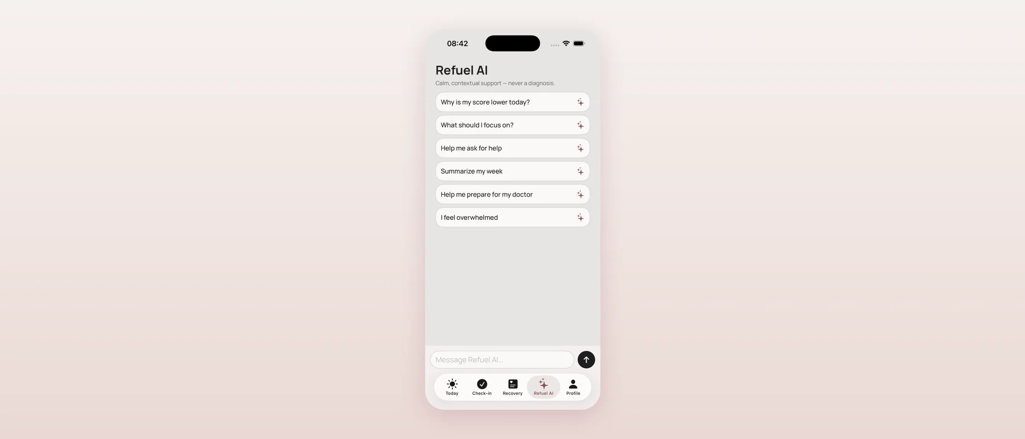
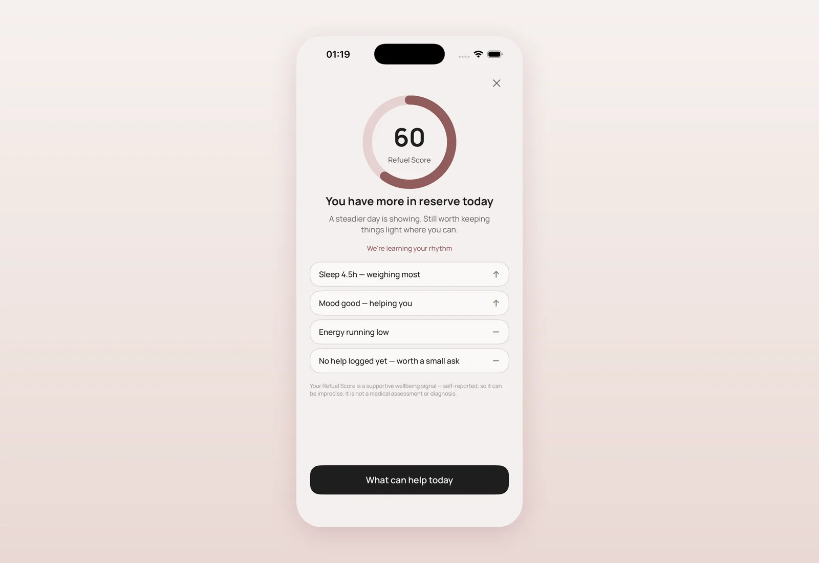
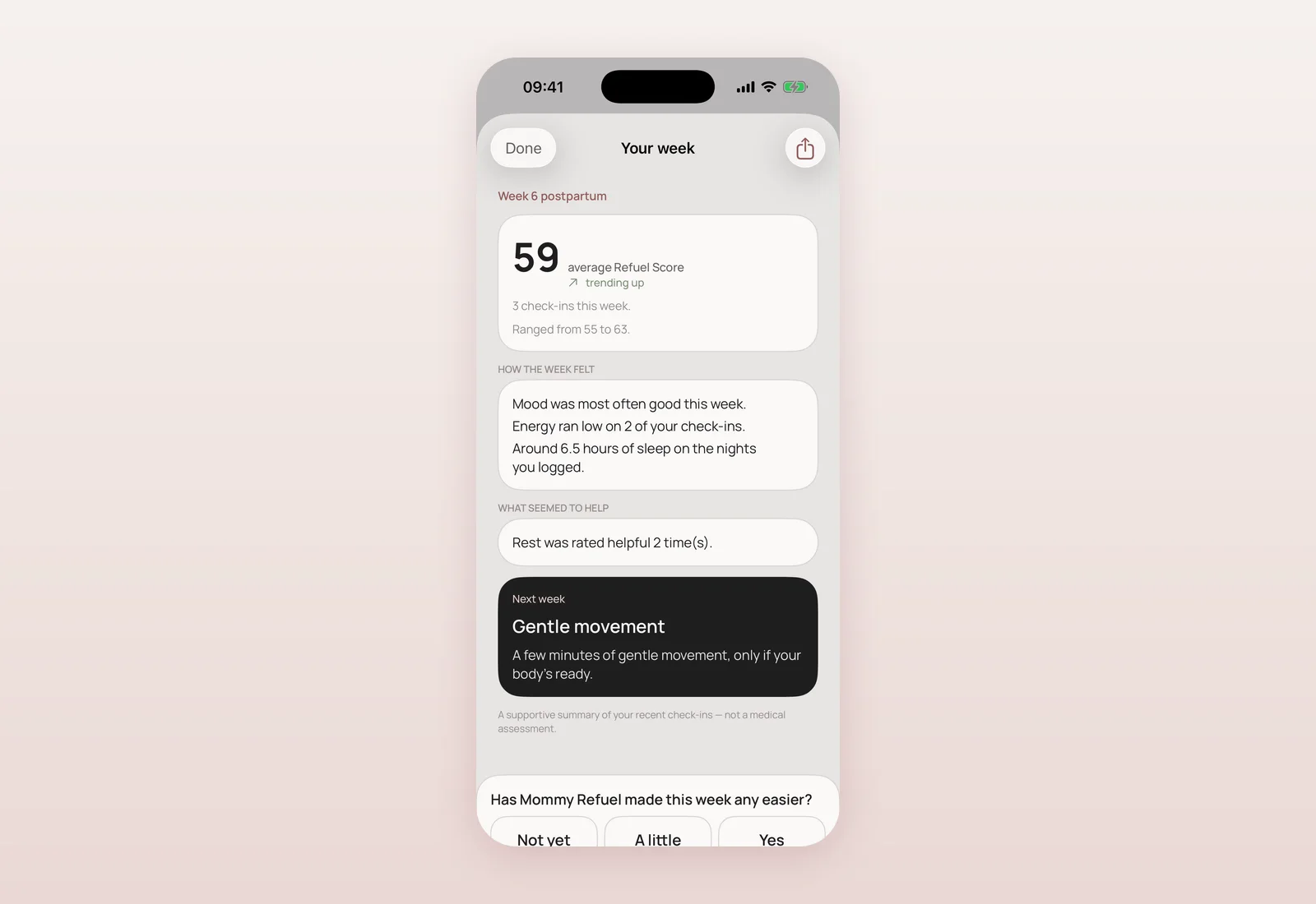
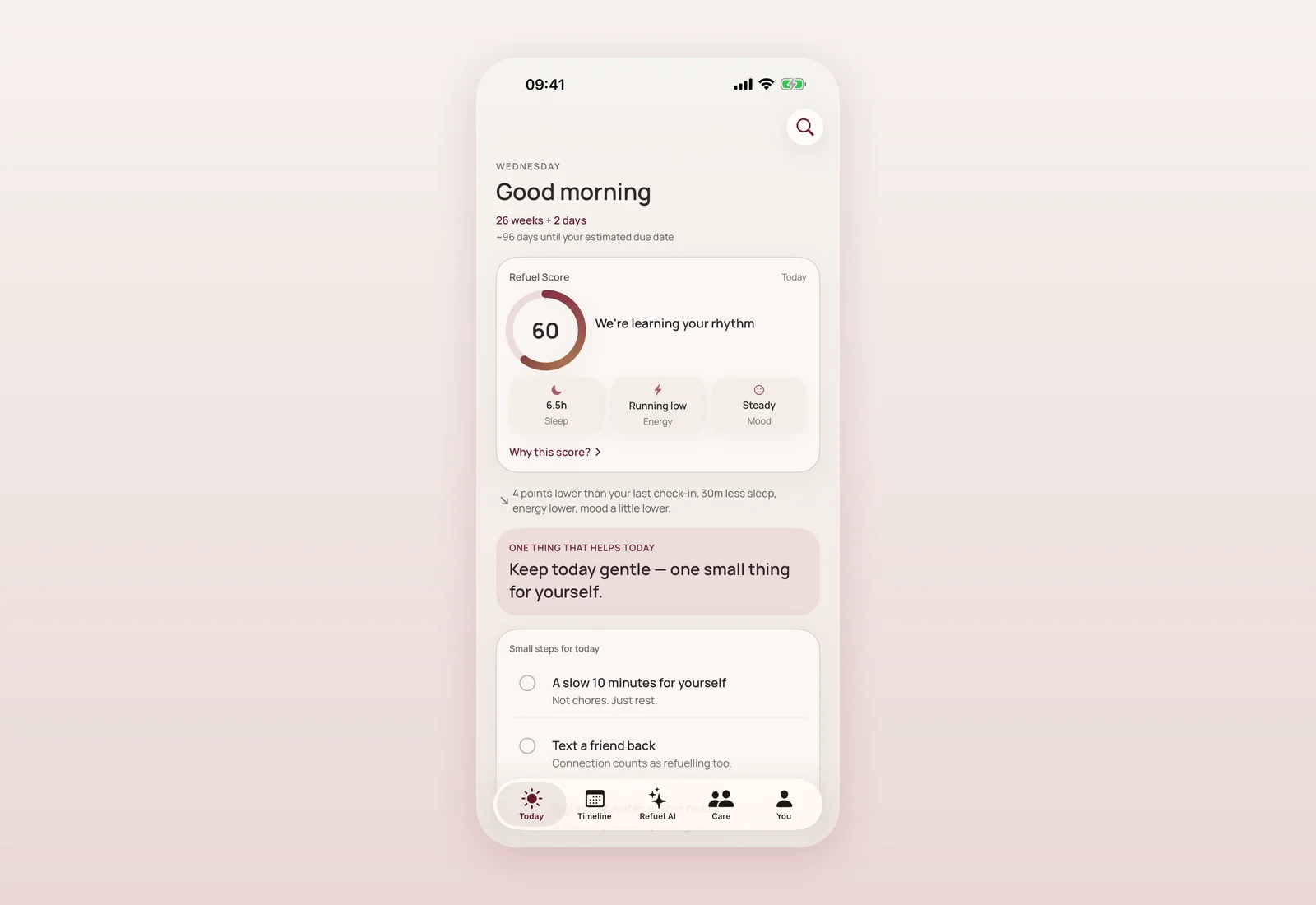
I was careful about honesty here in both directions. Shipped features get real screenshots from the actual running app, not staged marketing shots. Anything still on the roadmap is drawn as a diagram, never presented as a screenshot of something that does not exist yet, and every roadmap item is labelled plainly as available now, coming next, or future — never blurred together. The footer carries a clear not-a-medical-device disclaimer, and nothing on the site claims traction or user numbers we do not have.
Two more redesigns, same day
Later the same day I redesigned the site again — twice. The first pass (v2) fixed a layout bug where the navigation wrapped onto two rows on desktop because the header had never gotten proper flex styling, and used the opportunity to add a fixed, blurred header that hides on scroll, a full-bleed mega menu, larger display type, a paper-grain texture, and a scrollytelling home page with a pinned phone and a horizontal journey rail. The second pass (v3) went further: a full rebuild on Next.js aimed at a genuinely polished, high-craft feel, including a custom cursor that tracks the pointer and warms over interactive elements, and buttons with a subtle magnetic pull toward the cursor — both strictly progressive enhancements that disappear completely on touch devices and under reduced-motion settings, so nothing about the site depends on them working.
Partway through this, I made a decision I think matters more than any individual redesign: I dropped the serif typeface the site had been using and moved to a single design system shared with the app itself — one font family (Manrope, the same weights the app already bundles), the same colour tokens, the same corner-radius values. Before this, the website and the app were recognizably related but not really the same product visually. Now they are built from the same tokens, which is a small technical decision with an outsized effect on how trustworthy the whole thing feels.
Our first internal dashboard: the Control Center
The same day, I also built the first version of something nobody outside the team will ever see: an internal staff dashboard, the Control Center. Running a product honestly means being able to see, truthfully, whether it is healthy — active users, retention, feature adoption, how the AI assistant and its safety gate are actually performing, whether the system is up. I built it with a rule I care about a lot: when the real data source (Supabase) is not configured, it shows a clearly labelled demo view with fabricated numbers, never a production screen quietly showing fake data as if it were real. Access is role-based, with the most sensitive break-glass action (revealing personal information) restricted to the most senior role and requiring a written reason and a second confirmation step, with everything logged to an audit trail.
Later that same day I went further and hardened it: config failures now fail closed rather than silently falling back to a demo, an invite-only model governs who can even become staff, and the app itself started sending real, privacy-safe, value-free usage events (no personal content in any event property) to feed this dashboard honestly instead of it staying permanently empty.
Moving hosting to AWS
To close the day's infrastructure work, I moved everything the company can host off its previous third-party host onto AWS, keeping Supabase exactly where it was for data, authentication and row-level security — it was never on the old host to begin with. Three separate applications now deploy automatically from our main branch: the site, a landing app, and the Control Center itself. Domains stay pointed at the old setup until DNS is deliberately moved, so this was a hosting change with no visible disruption, not a cutover.
Where and when
- 2026-09-03, 00:56–06:22 — Full multi-page website foundation and deep content for every section (mom, AI, privacy & safety, care circle, baby, how it works, investors, about, planning, pregnancy, memories, health, marketplace, support, download, resources, privacy policy, terms), plus a generated sitemap and robots.txt — 20 routes × 2 languages (e54f5c4, 032ed02, bf149ca, b083180, bbcbb44, 2839e41, 70bb20c, f349954, c4d0506).
- 2026-09-03, 05:06 — Fixed the 242 KB embedded-image logo bug; replaced with light/dark vector marks (~3 KB each) (e899780, merged as PR #4 at 83b5d8f).
- 2026-09-03, 08:44 — Site v2: fixed header with a working desktop layout, full-bleed mega menu, motion system, restyled sub-pages (348a896, merged as PR #5 at 0dc653a).
- 2026-09-03, 08:54 — Design system unified with the app: dropped the serif typeface for Manrope only, colour and radius tokens now mirror the app's own (4131866).
- 2026-09-03, 12:27 — Site v3: a Next.js rebuild toward a more polished, high-craft experience (0e30640, merged as PR #6 at 9425e86).
- 2026-09-03, 13:27 — Control Center v1: first internal dashboard, privacy-safe metrics, role-based access, demo-vs-real data separation (1646d1b, merged as PR #8 at b185d2e).
- 2026-09-03, 15:34 — Site v3: custom cursor and magnetic buttons added as touch-safe, reduced-motion-safe progressive enhancements (35ababc).
- 2026-09-03, 17:01 — Control Center hardened: fail-closed configuration, invite-only staff access, real privacy-safe usage analytics wired from the app (a866523).
- 2026-09-03, 17:14–17:39 — Hosting for the site, landing page and Control Center moved to AWS via Terraform, Supabase kept as the backend; a non-destructive database verification harness added for future migrations (4c61db0, 933df76, 9921db2).
What this means if you visit the site
If you visited mommyrefuel.com before this day, you saw one landing page. If you visited after, you found a real, navigable site — every part of the app has its own honest page, in English and Ukrainian, with real screenshots where features exist and clearly labelled roadmap diagrams where they do not. None of this touched the app itself, and the internal dashboard is exactly that: internal. It exists so that decisions about the app get made from real numbers, not guesses, and its demo-mode honesty rule is the same principle running through everything else in this changelog.
Questions mothers ask
Why did the site get redesigned twice in one day?
The v2 pass fixed a real layout bug and modernized the header and motion. The v3 pass was a deeper rebuild on Next.js aimed at a more polished experience with a custom cursor and magnetic buttons. Both shipped the same day because the foundational multi-page content underneath stayed the same.
What was actually broken with the old logo?
The masthead logo file embedded a 242 KB image directly inside it and loaded it on every page. It was replaced with lightweight vector marks around 3 KB each, in light and dark variants.
What is the Control Center?
An internal staff dashboard for seeing how the app and its AI assistant are actually performing — active users, retention, feature adoption, system health. It is not visible to app users; access is role-based, and it never shows fabricated data on a real production screen without a clear demo label.
Did moving hosting to AWS affect Supabase or my data?
No. Supabase was never hosted on the previous provider and stays exactly where it is for data, authentication and access rules. Only the site, landing page and Control Center moved.
Does the website show real app screenshots or mockups?
Shipped features are shown with real screenshots captured from the running app. Anything still on the roadmap is shown as a labelled diagram, never presented as if it already exists.

Product designer and engineer from Kyiv who designed and built Mommy Refuel end to end. CTO at Kyiv Academy of Media Arts, founder of seven a.m. He writes every product update here: what shipped, where and when.
About SerhiiAvailability can vary with the installed app version. Statuses are founder-confirmed at the time of writing.