Key takeaways
- mommyrefuel.com moved from one long scrolling page to a real multi-page site with a proper two-column menu — every menu item now opens its own page.
- A faithful static mirror of the approved design (47 pages) became the actual production build that Amplify serves, replacing the previous build.
- Inner pages were retuned to match the home page's editorial voice: Manrope for headings, DM Sans for body text, the same burgundy/cream palette as the app.
- The site is now navigable end to end in nine languages: English, Ukrainian, Spanish, German, French, Polish, Italian, Portuguese and Russian — legal and safety text is intentionally left in English until it gets a professional review.
- SEO basics went in the same day: correct canonical URLs, a sitemap, Search Console verification, analytics, and social preview cards.
Why I'm writing about the website
Hi, I'm Serhii, the founder of Mommy Refuel. I usually write these updates about the app itself, but on September 13th the website changed more, in one day, than in the previous month combined — from a single scrolling landing page into something closer to a real product site. That's a milestone worth explaining properly, with the actual dates and what shipped where, instead of a one-line changelog entry.
This is the honest, detailed version: what the site looked like before, what changed, and what's still deliberately left for later.
From one scrolling page to a real multi-page site
Until this day, mommyrefuel.com was essentially one long home page with anchor links — click a menu item and you'd jump to a section of the same page. It told the story well, but it wasn't a real site: nothing had its own URL, its own title, or its own place to grow.
The rebuild gives every menu item a real page. A new full-screen menu opens from the header with two columns: on the left, the main destinations (Home, The app, Our vision, Investors, Let's talk); on the right, six category groups (features, care, motherhood, resources, company, legal) with every group name and every child link pointing somewhere real. On a phone, tapping a group name opens it and a separate arrow expands its sub-list, so nothing is accidentally hidden. Escape closes the menu, focus returns to where you were, and the current page is marked for screen readers. The old "Explore this page" / "dedicated pages coming soon" placeholders are gone, because now there's somewhere to go.
By the end of that first pass, the build was exporting 166 real, indexable pages — features, care, motherhood, plans, resources, company and legal — each with its own title, description and canonical URL, alongside the legacy routes redirected forward so nothing that used to work now 404s.
The design mirror stopped being a preview and became the live site
Before this, the approved visual design lived as a preview build. To make sure mommyrefuel.com matches it exactly, I captured a faithful, self-contained static mirror of that approved design — the home page plus 46 inner pages, with all of its real assets (styles, scripts, images and screenshots) — and then pointed the actual Amplify build at it. The site's build step now copies that mirror straight into the production output, so what you see on mommyrefuel.com is exactly the approved design, not an approximation of it rebuilt in a different framework. I sampled routes across the site after the switch (home, /app, /features/refuel-score, /care, /privacy) and they all rendered correctly.
Making every inner page feel like the home page
The home page had its own warm, editorial voice; the inner pages didn't quite match it yet. I retuned the whole design system so they belong to the same family: headings stay on Manrope (the app's display font), body copy moves to a pairing font (DM Sans) for readability, and the colour palette pulls directly from the app's own MRColor tokens — the same burgundy ink, warm paper background, and muted text and border colours the app uses. I checked this specifically on dark bands (text on the plum-coloured sections) to make sure contrast held up, and it did.
Real photos, real app screenshots — no mockups
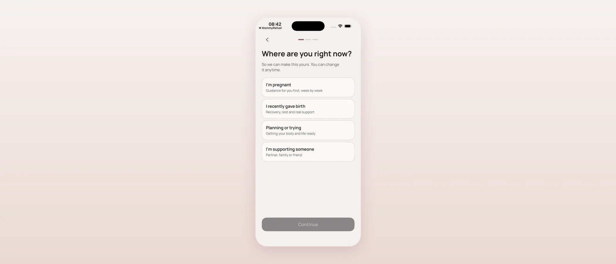
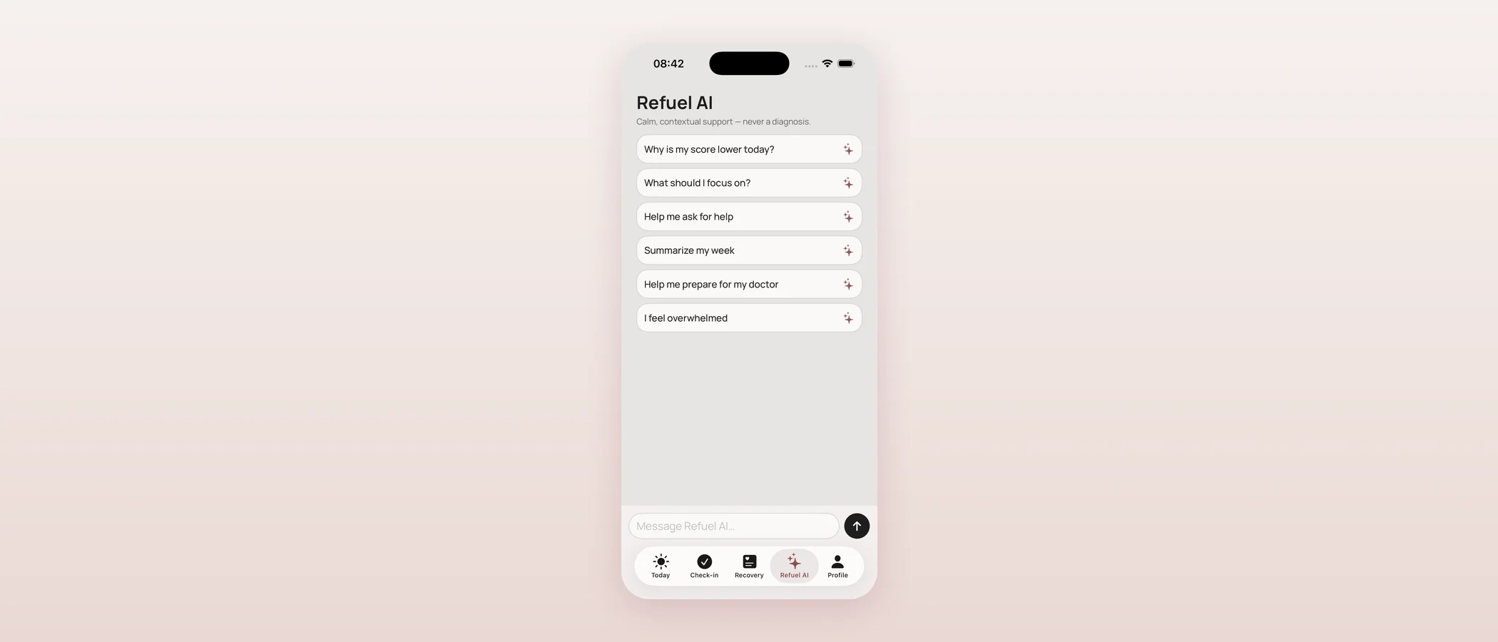
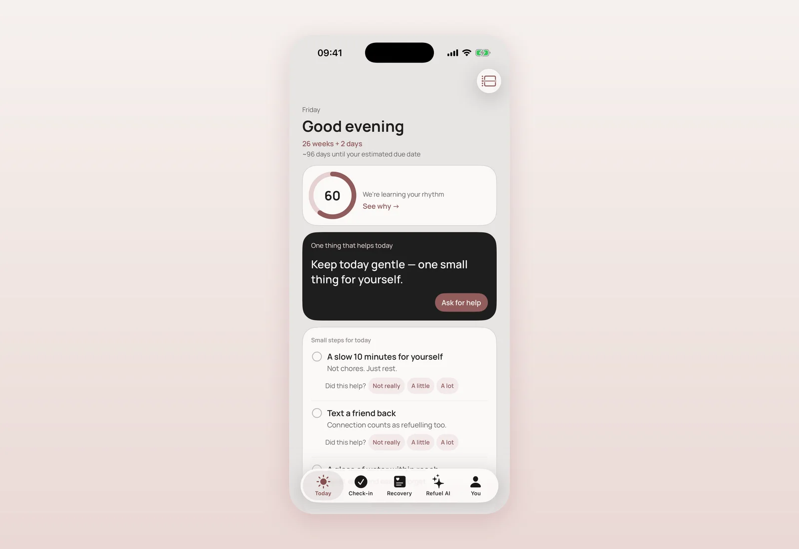
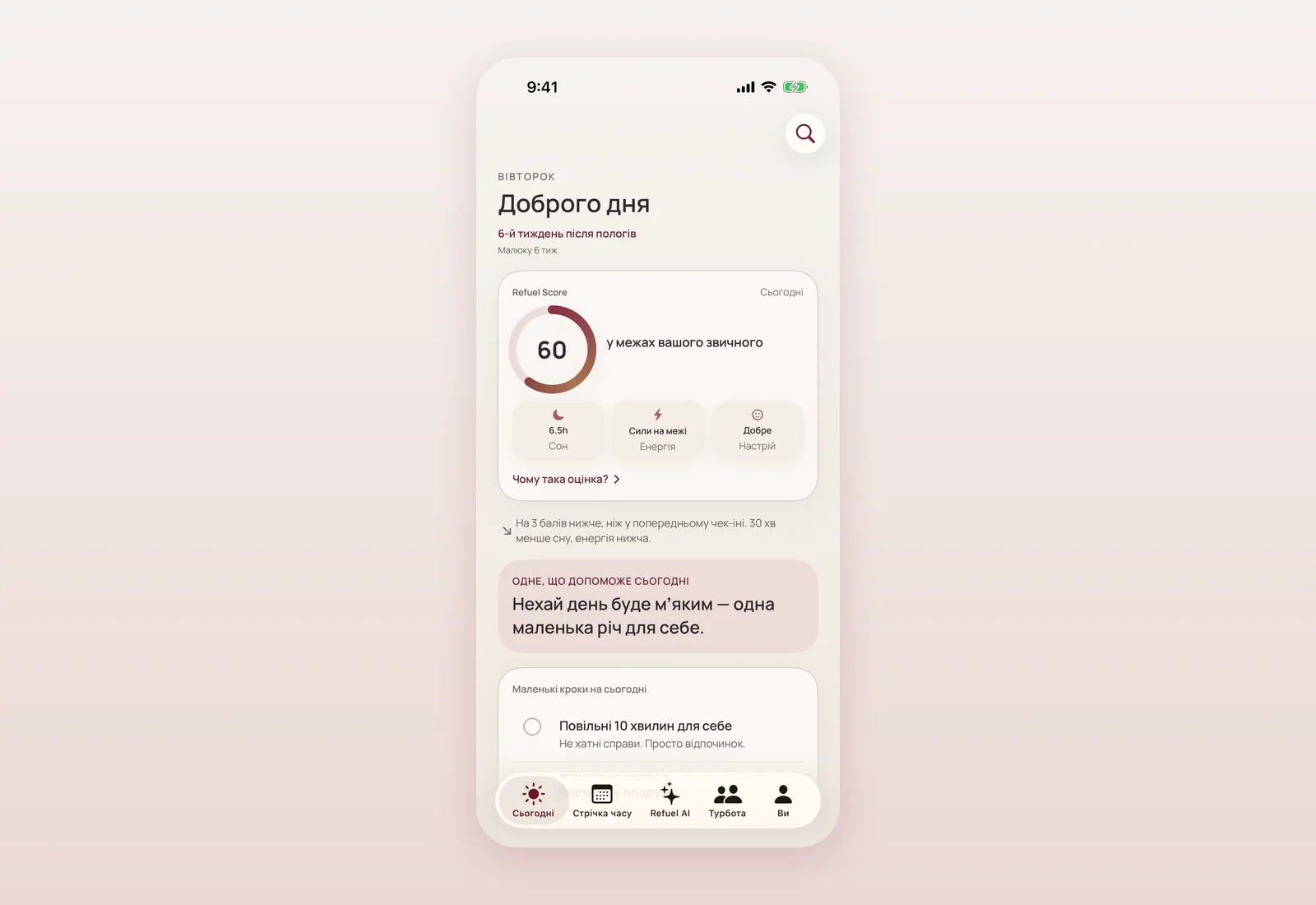
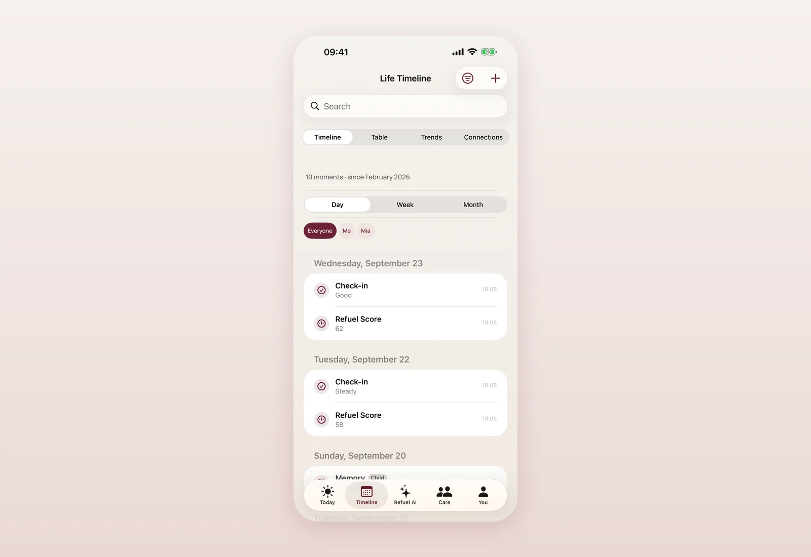
Every screenshot on the site is a real capture from the current app, not a mockup: I rewired mismatched pages so each block shows the screen it's actually about (the doctor-summary page, for instance, now shows the real "Prepare for appointment / Share as PDF" screen instead of an unrelated one).
For the editorial photography, I built out a proper pool of warm, licensed photos (all Unsplash License, free for commercial use) of mothers, babies and families, then spent real effort making sure no two neighbouring pages repeated the same photo — themed by section, so pregnancy pages show pregnant women, care pages show a caregiver with a child, and partnership-related pages show families. By the end of the day the site was drawing on 29 distinct photos with a consistent warm-cream colour grade, none repeated back to back.
Getting the site ready to be found
A real site needs to be findable. The same day, I fixed a canonical-URL bug that had every page pointing at the old preview domain instead of mommyrefuel.com — left alone, that would have kept Google from indexing the real site at all — and added a sitemap and robots.txt. I verified the domain in Google Search Console, added Google Analytics, and added OpenGraph and Twitter Card tags sitewide (with a proper preview image) so a shared link actually shows a card instead of nothing, in every language the page is available in.
The site goes from two languages to nine
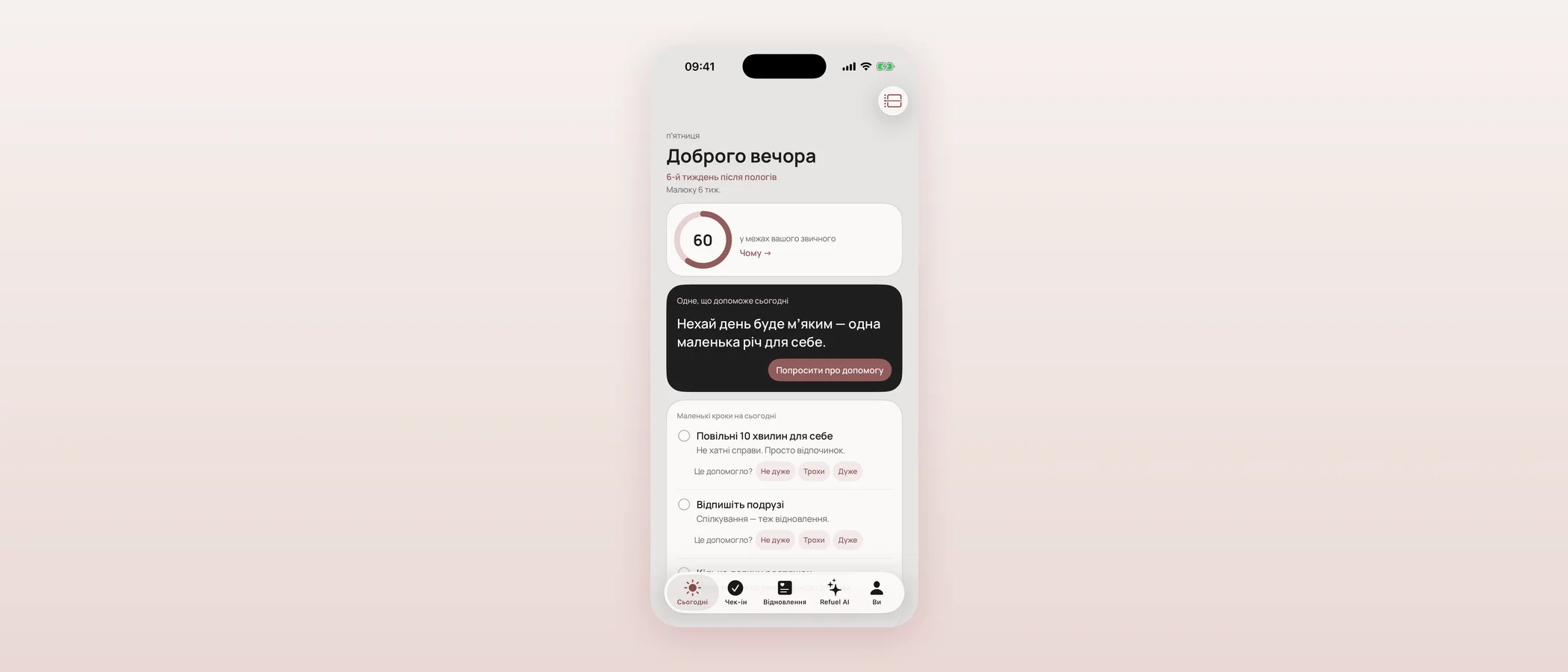
This is the part I'm most glad we pushed through in one sitting rather than dragging out over weeks. Starting from a quiet English/Ukrainian switcher on the home page, I built a reusable page-translation pipeline and ran it, page by page, until the whole site was in nine languages: English, Ukrainian, Spanish, German, French, Polish, Italian, Portuguese and Russian.
The order was deliberate: home page first (proving the switcher and hreflang setup work), then all six top pages (the app, care, vision, investors, about, contact), then the deeper sections — press and partnerships, plans and stories, the updates page, and finally the feature pages, the motherhood pages, and the care sub-pages. A late pass made sure translated pages link to each other in the same language instead of dropping a reader back into English mid-visit, and translated the shared header, menu and footer chrome too, so a page isn't just its body text translated with English navigation around it.
Two things stayed English on purpose. Legal pages (privacy, terms, the safety/AI trust pages) get a translated header and a clear in-language notice that the authoritative text is English, but the legal body itself isn't machine-translated — that's a professional-review job, not a same-day one. And Russian is offered specifically for Russian-speaking Ukrainians and Ukrainians abroad, alongside a short, honest statement on the about page: the app stands with Ukraine, does not support the Russian state's war, and is not distributed in Russia.
A few small, honest touches
Some smaller things worth noting for accuracy: the footer on every page now credits Mommy Refuel as one of the products of seven a.m., the studio I founded, with a link out. The investors and vision pages grew with more concrete, honest sections (what's live today, why now, how we build) rather than vague claims. I tried an animated "blob" effect on photo corners late in the day and reverted it the same evening — it didn't earn its place next to the calmer editorial layout, so the images are plain rectangles again, with rounded corners kept only for the in-app screenshots.
Where and when
- 09:37 — Inner pages retuned to the home page's editorial style: Manrope + DM Sans, burgundy/cream palette from MRColor (b2bb39c). Deployed to mommyrefuel.com.
- 10:04 — Full multi-page architecture with a real two-column menu; 166 pages exported (7279027). Deployed to mommyrefuel.com.
- 10:39 — Faithful static mirror of the approved design captured (47 pages + assets) (0911c9d).
- 10:51 — The Amplify production build switched to serve that mirror directly — mommyrefuel.com now serves the approved design exactly (03c286f). Deployed.
- 10:59 – 12:41 — Real app screenshots wired to the right pages; photo pool built out and themed by section; near-zero repeated images across pages (52da965, 4227c78, 570d667, 1acbc27, and related commits).
- 13:20 – 14:14 — Investors and vision pages expanded with concrete, honest sections (2049d56, a0004c5).
- 13:51 – 13:55 — SEO fixed: canonical URLs corrected sitewide, sitemap and robots.txt added (c22b129), Search Console verification added (be6a79f), Google Analytics added (84fbc6a).
- 17:23 – 19:55 — Site translated into Ukrainian, Spanish, German, French, Polish, Italian, Portuguese and Russian, page by page: home, top pages, contact, press & partnerships, plans & stories, updates, legal pages (chrome only), features hub, motherhood hub, care sub-pages, and everything remaining — full-site coverage in nine languages (8c00546 through c302319, ~20 commits).
- 19:01 – 19:11 — Footer attribution: Mommy Refuel is one of the products of seven a.m. (b91226f, 77724f9).
- 20:34 – 20:36 — Per-language page titles and meta descriptions; sitewide OpenGraph and Twitter Card tags for link previews (5e5a773, e561031). Deployed.
What's next
The app screenshots on the site still predate the app's most recent redesign (see the next update) — refreshing them is a separate, near-term task. The legal pages need a professional translation pass before I'll call them fully localized rather than English-with-a-translated-header. And now that the site has real, separate pages, I want to give it a real place for updates like this one — which is exactly what you're reading.
Questions mothers ask
Is mommyrefuel.com still built with Next.js?
The production build now serves a faithful static mirror of the approved design rather than the earlier Next.js build. The Next.js build is kept in the project as a fallback and could be brought back later; it isn't what's live today.
Are all nine languages fully translated by a human?
The page content was translated using a structured, reviewed translation pipeline (a machine-assisted first draft, applied consistently sitewide). Legal and safety pages are the exception: their body text is intentionally left in English until it gets a professional review, with a clear in-language notice saying so.
Why is Russian included given the war?
Russian is offered for the many Russian-speaking citizens of Ukraine and Ukrainians abroad who read it as a first language. The about page carries an explicit statement: the app stands with Ukraine, does not support the Russian state's war, and is not distributed in Russia.
Does this website change affect the iPhone app itself?
No — this update covers mommyrefuel.com only. The app had its own significant redesign and release work the same day, covered in a separate update.
Can I read this update in another language?
This blog is available in English and Ukrainian today; the wider site translation work described here is separate from the blog itself.

Product designer and engineer from Kyiv who designed and built Mommy Refuel end to end. CTO at Kyiv Academy of Media Arts, founder of seven a.m. He writes every product update here: what shipped, where and when.
About SerhiiAvailability can vary with the installed app version. Statuses are founder-confirmed at the time of writing.